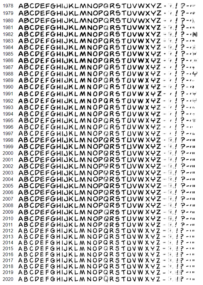
5148: Letter-averaged Garfield
| Letter-averaged Garfield |
 Made by: wye |
Explanation[edit | edit source]
The author writes:[edit | edit source]
The lettering of Garfield strips has evolved subtly over the years. I first noticed this when trying to mix and match text across "eras" for my own SRoMG submissions, and I thought it'd be interesting to visualize, which I've finally gotten around to.
I threw together a program that takes all non-Sunday Garfield strips up to 2020-07-22, detects the letters in them using a character recognition tool, and color-averages each letter per year (discarding outliers because OCR isn't perfect).
I'm really happy with the result because the letter shapes came out very clear and, though uniform at first glance, their lineup allows for some interesting insights: for example, note the change in width of the E, the change in shape of the Y, the apparent switch from hand-lettering to a computer font around 2012, some symbols being wonky due to sparse data and OCR mistakes, and the general distinction between the "70s", "80s", "90s" and "2000s" styles. I'm sure there are many more observations to be made.
You could conceivably turn this into a font (or ideally multiple, one to match each art style), barring kerning and cleanup. I won't be the one to do it, but I can provide the individual letter images if needed.
Transcript[edit | edit source]
{A table with 43 rows, labelled in order from 1978 to 2020, each saying ABCDEFGHIJKLMNOPQRSTUVWXYZ.,!?-'" in slightly different letters}